Introduction to matplotlib
This material is adapted from the Earth and Environmental Data Science, from Ryan Abernathey (Columbia University)
We saw numpy library in the previous notebook. Matplotlib is possibly the second fundamental pillar of the scientific python stack. You will find numerous tutorials for both libraries online.
Matplotlib is the dominant plotting / visualization package in python. It is important to learn to use it well.
I am asking you to learn the basics of both tools by yourself, at the pace that suits you. I can recommend these two tutorials:
from matplotlib import pyplot as plt
plt.ion()  # To trigger the interactive inline mode
Figure and Axes
The figure is the highest level of organization of matplotlib objects. If we want, we can create a figure explicitly.
fig = plt.figure()
<Figure size 432x288 with 0 Axes>
fig = plt.figure(figsize=(13, 5))
<Figure size 936x360 with 0 Axes>
fig = plt.figure()
ax = fig.add_axes([0, 0, 1, 1])
fig = plt.figure()
ax = fig.add_axes([0, 0, 0.5, 1])
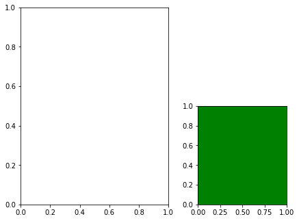
fig = plt.figure()
ax1 = fig.add_axes([0, 0, 0.5, 1])
ax2 = fig.add_axes([0.6, 0, 0.3, 0.5], facecolor='g')
Subplots
Subplot syntax is one way to specify the creation of multiple axes.
fig = plt.figure()
axes = fig.subplots(nrows=2, ncols=3)
fig = plt.figure(figsize=(12, 6))
axes = fig.subplots(nrows=2, ncols=3)
Tip
There is a shorthand for doing this all at once.
This is my recommended way to create new figures!
fig, ax = plt.subplots()
fig, axes = plt.subplots(ncols=2, figsize=(8, 4), subplot_kw={'facecolor': 'g'})
Drawing into axes
All plots are drawn into axes. It is easiest to understand how matplotlib works if you use the object-oriented style.
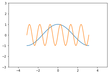
# create some data to plot
import numpy as np
x = np.linspace(-np.pi, np.pi, 100)
y = np.cos(x)
z = np.sin(6*x)
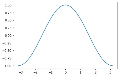
fig, ax = plt.subplots()
ax.plot(x, y)
[<matplotlib.lines.Line2D at 0x7f05e4577f10>]
This does the same thing as
plt.plot(x, y)
[<matplotlib.lines.Line2D at 0x7f05e4567370>]

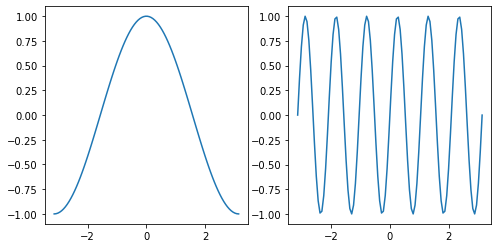
This starts to matter when we have multiple axes to worry about.
fig, axes = plt.subplots(figsize=(8, 4), ncols=2)
ax0, ax1 = axes
ax0.plot(x, y)
ax1.plot(x, z)
[<matplotlib.lines.Line2D at 0x7f05e46bd100>]
Labelling plots
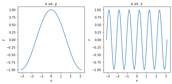
fig, axes = plt.subplots(figsize=(8, 4), ncols=2)
ax0, ax1 = axes

ax0.plot(x, y)
ax0.set_xlabel('x')
ax0.set_ylabel('y')
ax0.set_title('x vs. y')

ax1.plot(x, z)
ax1.set_xlabel('x')
ax1.set_ylabel('z')
ax1.set_title('x vs. z')

# squeeze everything in
plt.tight_layout()
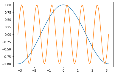
Customizing Line Plots
fig, ax = plt.subplots()
ax.plot(x, y, x, z)
[<matplotlib.lines.Line2D at 0x7f05ecb4df70>,
 <matplotlib.lines.Line2D at 0x7f05ecb4dee0>]
It’s simple to switch axes
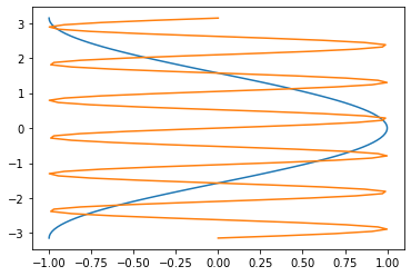
fig, ax = plt.subplots()
ax.plot(y, x, z, x)
[<matplotlib.lines.Line2D at 0x7f05e46d74f0>,
 <matplotlib.lines.Line2D at 0x7f05e46d7520>]
Line Styles
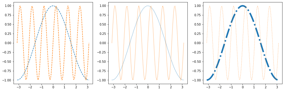
fig, axes = plt.subplots(figsize=(16, 5), ncols=3)
axes[0].plot(x, y, linestyle='dashed')
axes[0].plot(x, z, linestyle='--')

axes[1].plot(x, y, linestyle='dotted')
axes[1].plot(x, z, linestyle=':')

axes[2].plot(x, y, linestyle='dashdot', linewidth=5)
axes[2].plot(x, z, linestyle='-.', linewidth=0.5)
[<matplotlib.lines.Line2D at 0x7f05e48c2190>]
Colors
As described in the colors documentation, there are some special codes for commonly used colors:
b: blue
g: green
r: red
c: cyan
m: magenta
y: yellow
k: black
w: white
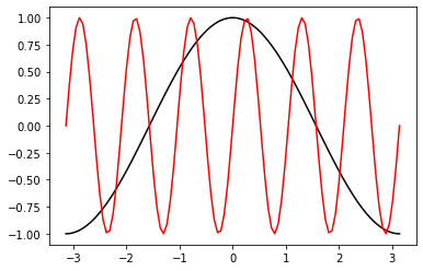
fig, ax = plt.subplots()
ax.plot(x, y, color='k')
ax.plot(x, z, color='r')
[<matplotlib.lines.Line2D at 0x7f05e477a640>]
Other ways to specify colors:
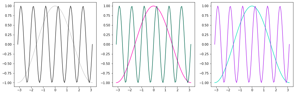
fig, axes = plt.subplots(figsize=(16, 5), ncols=3)

# grayscale
axes[0].plot(x, y, color='0.8')
axes[0].plot(x, z, color='0.2')

# RGB tuple
axes[1].plot(x, y, color=(1, 0, 0.7))
axes[1].plot(x, z, color=(0, 0.4, 0.3))

# HTML hex code
axes[2].plot(x, y, color='#00dcba')
axes[2].plot(x, z, color='#b029ee')
[<matplotlib.lines.Line2D at 0x7f05e2c56a00>]
There is a default color cycle built into matplotlib.
plt.rcParams['axes.prop_cycle']
| 'color' |
|---|
| '#1f77b4' |
| '#ff7f0e' |
| '#2ca02c' |
| '#d62728' |
| '#9467bd' |
| '#8c564b' |
| '#e377c2' |
| '#7f7f7f' |
| '#bcbd22' |
| '#17becf' |
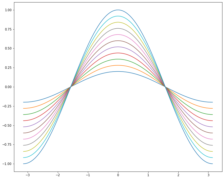
fig, ax = plt.subplots(figsize=(12, 10))
for factor in np.linspace(0.2, 1, 11):
    ax.plot(x, factor*y)
Markers
There are lots of different markers availabile in matplotlib!
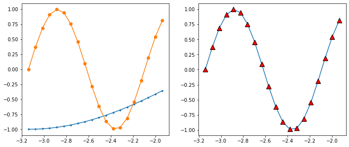
fig, axes = plt.subplots(figsize=(12, 5), ncols=2)

axes[0].plot(x[:20], y[:20], marker='.')
axes[0].plot(x[:20], z[:20], marker='o')

axes[1].plot(x[:20], z[:20], marker='^',
             markersize=10, markerfacecolor='r',
             markeredgecolor='k')
[<matplotlib.lines.Line2D at 0x7f05e2b32e50>]
Label, Ticks, and Gridlines
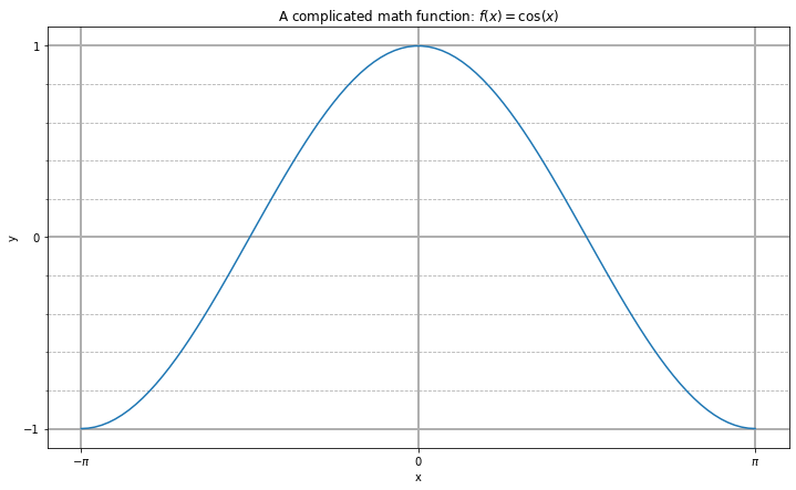
fig, ax = plt.subplots(figsize=(12, 7))
ax.plot(x, y)

ax.set_xlabel('x')
ax.set_ylabel('y')
ax.set_title(r'A complicated math function: $f(x) = \cos(x)$')

ax.set_xticks(np.pi * np.array([-1, 0, 1]))
ax.set_xticklabels([r'$-\pi$', '0', r'$\pi$'])
ax.set_yticks([-1, 0, 1])

ax.set_yticks(np.arange(-1, 1.1, 0.2), minor=True)
#ax.set_xticks(np.arange(-3, 3.1, 0.2), minor=True)

ax.grid(which='minor', linestyle='--')
ax.grid(which='major', linewidth=2)
Axis Limits
fig, ax = plt.subplots()
ax.plot(x, y, x, z)
ax.set_xlim(-5, 5)
ax.set_ylim(-3, 3)
(-3.0, 3.0)
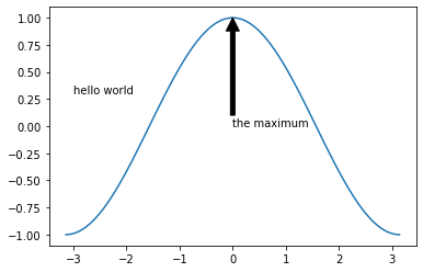
Text Annotations
fig, ax = plt.subplots()
ax.plot(x, y)
ax.text(-3, 0.3, 'hello world')
ax.annotate('the maximum', xy=(0, 1),
             xytext=(0, 0), arrowprops={'facecolor': 'k'})
Text(0, 0, 'the maximum')
Other 1D Plots
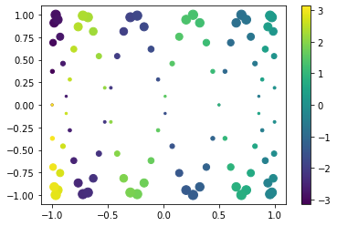
Scatter Plots
fig, ax = plt.subplots()

splot = ax.scatter(y, z, c=x, s=(100*z**2 + 5))
fig.colorbar(splot)
<matplotlib.colorbar.Colorbar at 0x7f05e294f070>
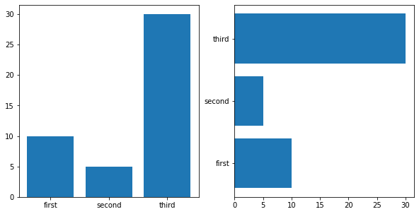
Bar Plots
labels = ['first', 'second', 'third']
values = [10, 5, 30]

fig, axes = plt.subplots(figsize=(10, 5), ncols=2)
axes[0].bar(labels, values)
axes[1].barh(labels, values)
<BarContainer object of 3 artists>
2D Plotting Methods
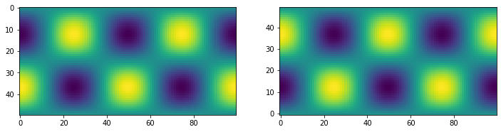
imshow
x1d = np.linspace(-2*np.pi, 2*np.pi, 100)
y1d = np.linspace(-np.pi, np.pi, 50)
xx, yy = np.meshgrid(x1d, y1d)
f = np.cos(xx) * np.sin(yy)
print(f.shape)
(50, 100)
fig, ax = plt.subplots(figsize=(12,4), ncols=2)
ax[0].imshow(f)
ax[1].imshow(f, origin='lower')
<matplotlib.image.AxesImage at 0x7f05e28b0280>
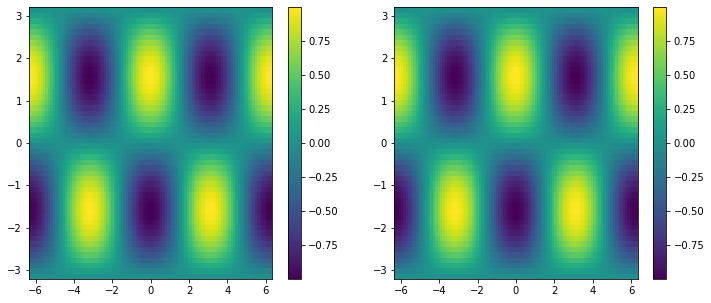
pcolormesh
If you want to get an idea of it does you can use the question mark at the end of the function.
It will return the main components and parameters definitions
plt.pcolormesh?
fig, ax = plt.subplots(ncols=2, figsize=(12, 5))
pc0 = ax[0].pcolormesh(x1d, y1d, f, shading='auto')
pc1 = ax[1].pcolormesh(xx, yy, f, shading='auto')
fig.colorbar(pc0, ax=ax[0])
fig.colorbar(pc1, ax=ax[1])
<matplotlib.colorbar.Colorbar at 0x7f05e26eb490>
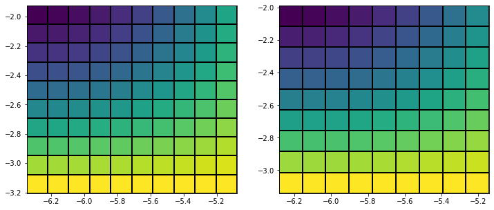
x_sm, y_sm, f_sm = xx[:10, :10], yy[:10, :10], f[:10, :10]

fig, ax = plt.subplots(figsize=(12,5), ncols=2)

# last row and column ignored!
ax[0].pcolormesh(x_sm, y_sm, f_sm, edgecolors='k', shading='auto')

# same!
ax[1].pcolormesh(x_sm, y_sm, f_sm[:-1, :-1], edgecolors='k', shading='auto')
<matplotlib.collections.QuadMesh at 0x7f05e2630b50>
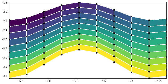
y_distorted = y_sm*(1 + 0.1*np.cos(6*x_sm))

plt.figure(figsize=(12,6))
plt.pcolormesh(x_sm, y_distorted, f_sm[:-1, :-1], edgecolors='w', shading='auto')
plt.scatter(x_sm, y_distorted, c='k')
<matplotlib.collections.PathCollection at 0x7f05e299d220>
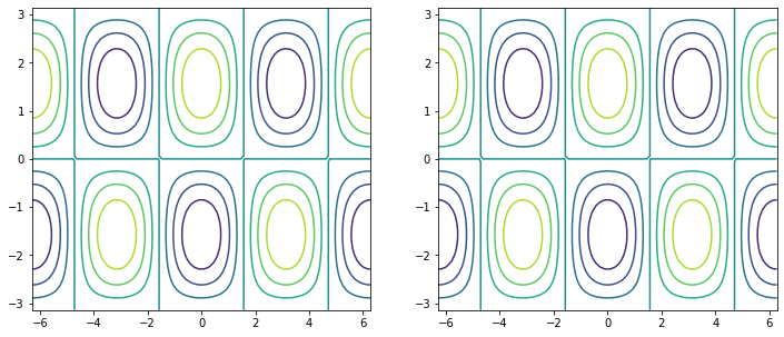
contour / contourf
fig, ax = plt.subplots(figsize=(12, 5), ncols=2)

# same thing!
ax[0].contour(x1d, y1d, f)
ax[1].contour(xx, yy, f)
<matplotlib.contour.QuadContourSet at 0x7f05e26c8e80>
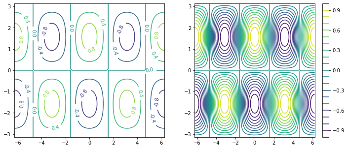
fig, ax = plt.subplots(figsize=(12, 5), ncols=2)

c0 = ax[0].contour(xx, yy, f, 5)
c1 = ax[1].contour(xx, yy, f, 20)

plt.clabel(c0, fmt='%2.1f')
plt.colorbar(c1, ax=ax[1])
<matplotlib.colorbar.Colorbar at 0x7f05e24d1dc0>
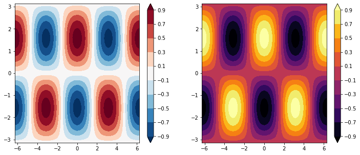
fig, ax = plt.subplots(figsize=(12, 5), ncols=2)

clevels = np.arange(-1, 1, 0.2) + 0.1

cf0 = ax[0].contourf(xx, yy, f, clevels, cmap='RdBu_r', extend='both')
cf1 = ax[1].contourf(xx, yy, f, clevels, cmap='inferno', extend='both')

fig.colorbar(cf0, ax=ax[0])
fig.colorbar(cf1, ax=ax[1])
<matplotlib.colorbar.Colorbar at 0x7f05e2371820>
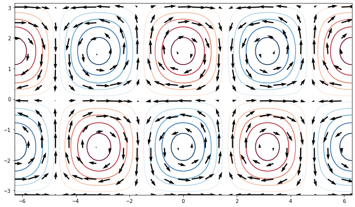
quiver
u = -np.cos(xx) * np.cos(yy)
v = -np.sin(xx) * np.sin(yy)

fig, ax = plt.subplots(figsize=(12, 7))
ax.contour(xx, yy, f, clevels, cmap='RdBu_r', extend='both', zorder=0)
ax.quiver(xx[::4, ::4], yy[::4, ::4],
           u[::4, ::4], v[::4, ::4], zorder=1)
<matplotlib.quiver.Quiver at 0x7f05e22f4fa0>
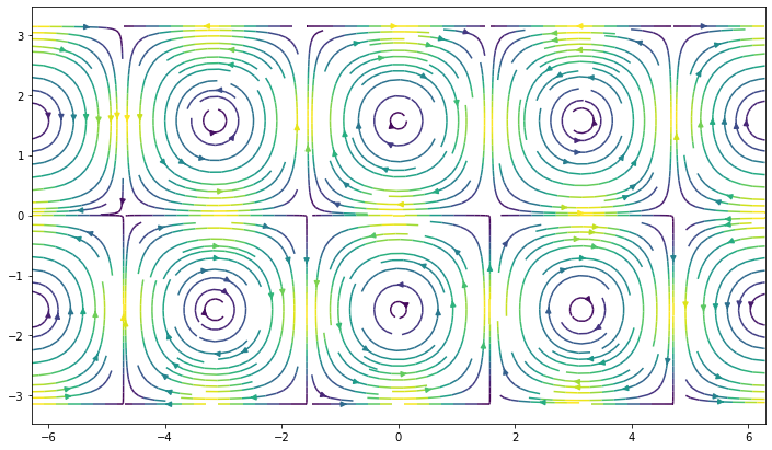
streamplot
fig, ax = plt.subplots(figsize=(12, 7))
ax.streamplot(xx, yy, u, v, density=2, color=(u**2 + v**2))
<matplotlib.streamplot.StreamplotSet at 0x7f05e1deb970>